Search Query Performance Dashboard
What is the Search Query Performance Report?
The Search Query Performance (SQP) Report is a powerful dataset provided by Amazon through Brand Analytics. It gives brand-registered sellers access to detailed, aggregated search funnel data tied to specific customer search terms on Amazon.
Each report shows performance data at the search query level, across the full shopper journey:
Impressions — how often a search term led to a product being shown
Clicks — how many times a product was clicked after the search
Cart Adds — how often a product was added to a cart
Purchases — how many purchases resulted from a search
The data is broken down by brand and overall market, giving you a benchmarked view of how your ASINs perform relative to competitors for each query.
This report is refreshed weekly and is only available to brand-registered sellers.
What Can You Do With This Data?
The SQP data offers powerful insights to help you optimize your visibility, conversions, and strategy on Amazon. With this data, you can:
Discover High-Value Search Terms: Identify which search queries drive the most impressions, clicks, and purchases—so you can target them in your ad strategy and content optimization.
Benchmark Against the Market: Understand how your brand’s performance compares to the market at each stage of the funnel (impressions, clicks, conversions). Spot where you’re outperforming—or falling behind.
Diagnose Funnel Drop-offs: See where your visibility or conversion rates dip. Are shoppers seeing your listings but not clicking? Clicking but not buying? This helps pinpoint ASINs or queries that need improvement.
Find Keyword Gaps: Uncover high-volume queries where your products aren’t showing or converting—offering potential opportunities for new ads, SEO improvements, or product positioning.
Monitor Trends Over Time: Track how your share of impressions, clicks, and purchases changes week-over-week to evaluate the impact of campaigns, listing changes, or competitive shifts.
Getting Started with 3fin’s SQP Dashboard
Step 1: Start Syncing ASINs

Before you can access Search Query Performance (SQP) data in 3fin, you need to select which ASINs to track. This ensures 3fin pulls the relevant SQP metrics for those products.
How to Add ASINs for SQP Sync:
Go to Settings > Company
In the main menu, click Settings
Select Company from the submenu
Navigate to the SQP Tab
Click on the SQP tab at the top of the Company settings page
Choose a Marketplace
Use the country dropdown to select the Amazon marketplace you want to sync (e.g. United States)
Filter and Select Products
Click “Add product filters” to narrow down the list of ASINs you want to include
Use filters like brand, tag, or product category to find specific items
Click “Add”
Once your selection is ready, click the Add button
3fin will begin syncing SQP data for the selected ASINs within the next 24 hours
You’ll now see those ASINs listed under their respective marketplace, and their data will be available in the SQP dashboards once syncing is complete.
Step 2: Filter ASINs and Queries to Start Exploring Data
Once your ASIN data has finished syncing, you’re ready to begin exploring your SQP insights.
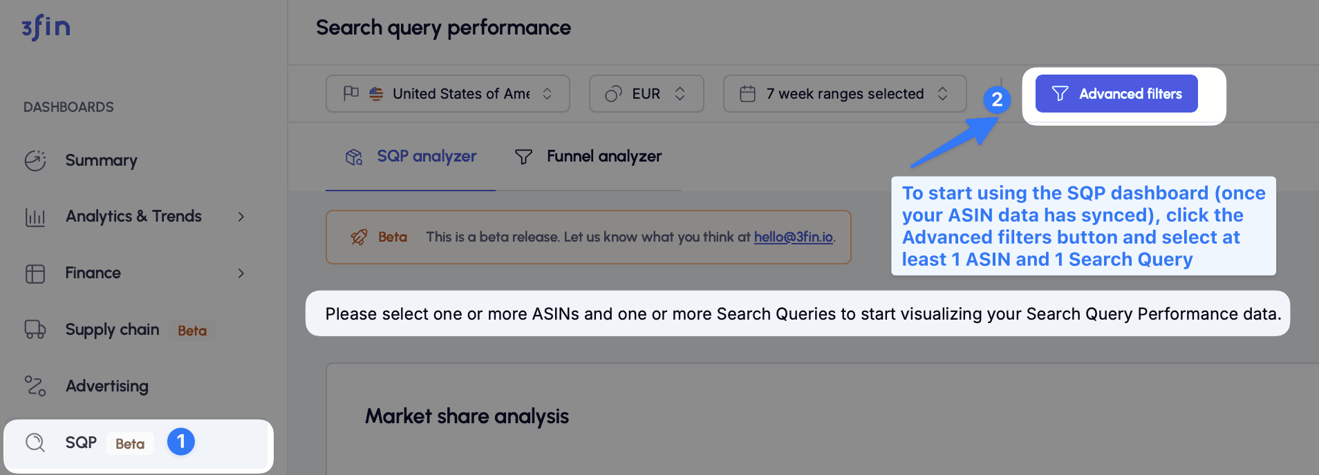
How to Start Using the SQP Dashboard
Navigate to the SQP Dashboard
Click SQP in the left-hand menu.
Open Advanced Filters
In the top right of the dashboard, click the “Advanced filters” button.
Select at Least One ASIN and One Search Query
From the filter modal, choose one or more ASINs that have synced.
Select at least one search query (you can use saved lists or individual selections).
These selections are required to load and visualize any data.
Apply Filters
Once your selections are made, apply the filters to populate the dashboard with your SQP data.
⚠️ Note: If no data appears, double-check that your selected ASINs are synced and have been assigned to the correct marketplace.
You’re now ready to explore funnel performance, search trends, and competitive benchmarks using your real Amazon data.
SQP Analyzer Tab
The SQP Analyzer tab is your go-to dashboard for tracking market share performance and funnel metrics over time, based on selected ASINs and search queries.
Market Share Analysis Graph
At the top of the dashboard, the Market Share Analysis graph provides a visual overview of how your brand is performing across the Amazon search funnel.
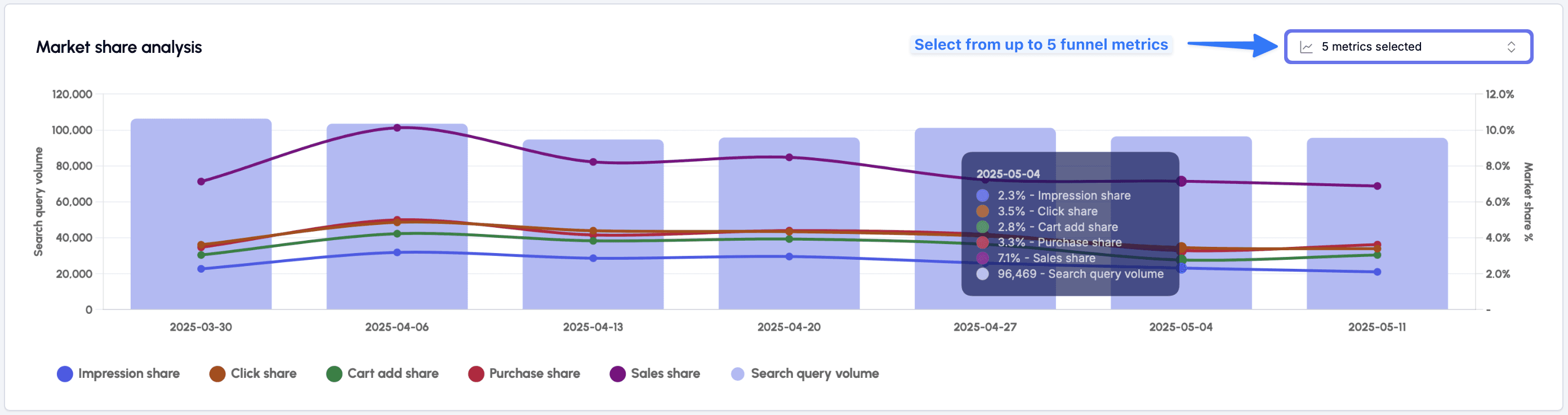
Metrics You Can Visualize
You can choose up to 5 metrics to display simultaneously using the dropdown in the top-right corner of the chart:
Impression share
Click share
Add to cart share
Purchase share
Sales share
By default, the chart also shows the search query volume (in purple bars) across your selected time range.
Why It Matters
This graph is ideal for:
Monitoring market share trends over time
Assessing the impact of changes, such as:
Advertising campaigns → monitor impression share
Listing updates, pricing changes, or reviews → monitor click and cart share
Spotting drops or spikes in visibility and conversion for key queries
Use this as a high-level health check on your brand’s visibility and performance in Amazon search results.
SQP Analyzer Table
Beneath the graph, the SQP Analyzer Table gives you a flexible, detailed view of the metrics that matter most to your business.

Key Features
Displays all core metrics from the Search Query Performance Report
Includes additional 3fin-calculated metrics such as:
Estimated sales
Sales market share
Customize Your View
Click “Select KPIs” (top right) to open the KPI Selector
Choose the metrics you want to display
Save your selections as custom KPI lists for future reuse
Grouping Options
By default, data is grouped by week
You can choose “Group by week & search query” (top-left dropdown) to break results down by both time and query
Tip: this option is only available when 5 or fewer search queries are selected
Export to CSV
Like all tables in 3fin, the SQP Analyzer table can be exported to CSV using the download icon.
Filter Selection
All data shown in this tab is scoped to your Filter settings:
ASINs
Search queries or saved query lists
Time range
Marketplace
Together, the Market Share Analysis and SQP Analyzer Table give you a comprehensive view of your brand’s performance in search - helping you turn insights into action.
Funnel Analyzer Tab
SQP Tiles & Brand vs. Market Funnel
The Funnel Analyzer tab helps you evaluate your performance across the entire Amazon search funnel - from impressions all the way to purchases - while benchmarking against the market.
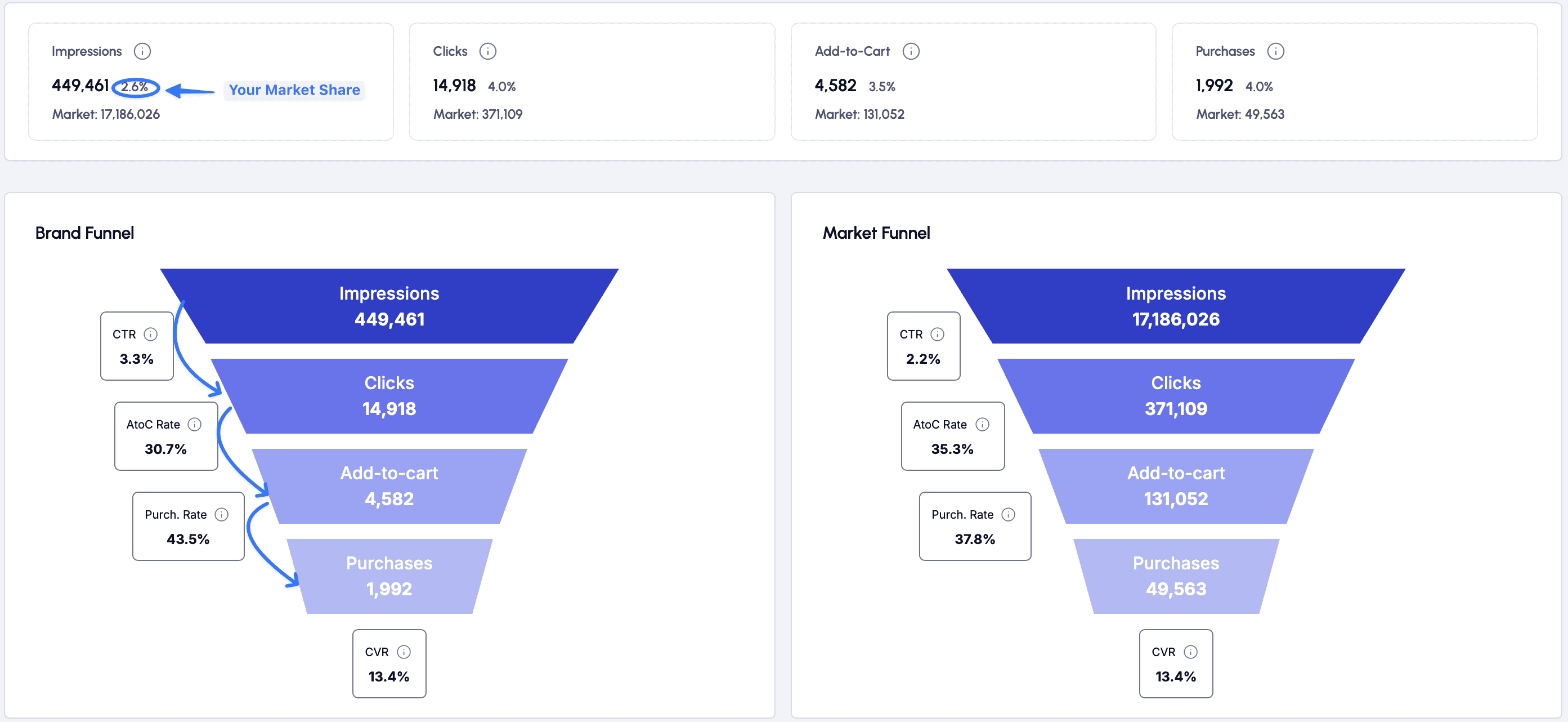
This top section of the Funnel Analyzer includes:
SQP Tiles
At the top of the dashboard, you’ll see a set of summary tiles showing your brand’s performance and market share at each stage of the funnel:
Impressions
Clicks
Add-to-Cart
Purchases
Each tile displays:
Your brand’s total count
The market total for the selected search queries and ASINs
Your market share % for that stage
These KPIs offer a quick overview of your visibility and conversion strength relative to the competition.
Brand vs. Market Funnel
Below the tiles, the dashboard presents two side-by-side funnel visualizations:
Brand Funnel (left): Shows your brand’s performance across all funnel stages
Market Funnel (right): Represents the same data for the overall market (all other brands)
Each funnel breaks down performance across:
Impressions
Clicks
Add-to-Cart
Purchases
Alongside each step, you’ll see the conversion rate to the next stage, including:
CTR (Click-Through Rate): Clicks ÷ Impressions
AtoC Rate (Add-to-Cart): Carts ÷ Clicks
Purchase Rate: Purchases ÷ Add-to-Carts
CVR (Conversion Rate): Purchases ÷ Clicks
These visual funnels make it easy to compare brand vs. market efficiency
Whether you’re losing shoppers early (low CTR) or late (low purchase rate), this view helps pinpoint where to optimize.
Brand vs. Market Funnel Rates

This bar chart gives you a side-by-side comparison of your brand’s performance vs. the overall market across key conversion rates in the search funnel:
Metrics Compared:
Click-Through Rate (CTR): How often shoppers click after seeing your products. Calculatd as: Clicks ÷ Impressions
Add-to-Cart Rate: How often shoppers add your product to their cart after clicking. Calculated as: Cart Adds ÷ Clicks
Purchase Rate: How often shoppers complete a purchase after adding to cart. Calculated as: Purchases ÷ Cart Adds
Conversion Rate (CVR): Overall conversion from click to purchase. Calculated as: Purchases ÷ Clicks
Each metric is displayed in two colors:
Light Blue = Your Brand
Dark Blue = Market
Why This Matters
This chart helps you quickly identify where you’re outperforming or underperforming relative to your competitors. For example:
A higher CTR suggests strong content, thumbnails, and relevance
A lower Add-to-Cart Rate might indicate price sensitivity or weak offers
A higher CVR reflects a solid end-to-end shopper experience
Use this chart to uncover conversion bottlenecks, validate improvements, or identify areas for testing.
Brand vs. Market Table
At the bottom of the Funnel Analyzer tab, you’ll find the Brand vs. Market Table — a detailed, week-by-week breakdown of your brand’s performance compared to the overall market across key conversion rates.

What’s Included?
For each week, the table shows:
Search Query Volume: Total volume for the selected query or queries
Click-Through Rate (CTR): % of impressions that led to a click
Add-to-Cart Rate: % of clicks that resulted in a cart add
Purchase Rate: % of carts that converted to purchases
Conversion Rate (CVR): % of clicks that resulted in purchases
Each metric is split into two columns:
Brand performance
Market benchmark
Percent Difference vs. Market is shown in color-coded tags to highlight how your brand compares:
Green = outperforming the market
Red = underperforming the market
This makes it easy to spot where you’re leading or lagging across the funnel - week by week.
Why It’s Useful?
Track performance trends: See how funnel metrics evolve over time
Spot strengths and weaknesses: Identify where your brand is gaining or losing ground
Prioritize optimization: Focus efforts where your brand is underperforming
As with all 3fin tables, you can export this data to CSV using the download icon at the top left of the table.